Trianglize

All fields below are required, unless otherwise indicated.

"Trianglism is the fusion of trigonometry1, color psychology2, and artistry."
― DJ Abrams

"Art for artist's sake."3
― DJ Abrams


The Trianglize App allows you, the Artist, to transform your image as conforming to the Art form of Trianglism.

We highly recommend you fully read the page. A lot of verbiage to describe the process, but it is necessary. Like Trianglism, it is a technically precise and creative process. And, can be finicky. To get the most out of it to create that perfect image, you should fully tune in. It will be worth it. Enjoy!

hoodPALS Trianglism Page

Example (Thumbnails) :: Andy Warhol

Triangles Example :: Andy Warhol as Before Triangles Example :: Andy Warhol as After

Trianglism is dedicated to Andy Warhol.

Let's start . . .


Step 1 :: Canvas

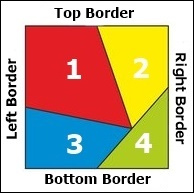
  1. Upload or fetch file to be trianglized: rendered as 4 colored triangles framed as a square.
  2. Only GIF, JPEG, JPG, and PNG files allowed.
  3. Maximum file size allowed is 10 MB (10,485,760 Bytes).
  4. Uploaded images should be square. If an image is discovered to be rectangular, it will be AI rendered as a square.
  5. For maximum effect, uploaded images should be black and white (grayscale using tones ranging from black to white through intermediate shades of gray). The choice is yours. Colors in the uploaded image (bottom layer) can interfere with the triangle colors (upper layer). It will vary with the degree of Transparency. More opaque the Transparency, less the interference. So, bear this in mind. You do have the option to force the app to grayscale your image.
  6. About the Subject. Your Subject ideally should be a close-up portrait image: "front profile" where the front or forward-facing part is presented directly to the viewer. Preferably use a high resolution image comparable in size to the desired trianglized image. Higher the resolution, greater the resolution of the desired trianglized image. Subject can whatever you desire to trianglize and profile: person, place, or thing. For example: you, or your home town of Paris, or the Eiffel Tower in Paris.
  7. Do not link to images on this server. Download for usage. Images are automatically deleted hourly.


File uploaded: None


OR


For maximum effect, uploaded images should be black and white (grayscale using tones ranging from black to white through intermediate shades of gray). The choice is yours. Colors in the uploaded image (bottom layer) can interfere with the Triangle Colors (upper layer). It will vary with the degree of Transparency. More opaque the Transparency, less the interference. Disable if uploaded image is already in grayscale.


If the image is rotated incorrectly, you can correct by Rotating Image here to the desired orientation.

Step 2 :: Borders


1.00 x 1.00 in

Border Background Color

Border Font Color

Step 3 :: Triangles


<verbiage>

Special note about the triangles. Number, shape, and placement of triangles cannot be adjusted. To allow this would violate or muddy the brand and underlying concept and theme of Trianglism. More about this can be discovered on our hoodPALS Trianglism Page

Triangle Color

  • You can color the triangles. This is the fun and meaningful part of the process! Each triangle paints a perspective of the Subject in the photo. For example, using color to describe a person is a metaphorical and symbolic way to express personality traits or emotional states. It's not about literal skin color but rather about associating colors with characteristics. For example, someone described as "fiery red" might be seen as bold and energetic, while someone described as "cool blue" might be seen as calm and composed. The triangles are of varying sizes. For example, if the Subject is more often bold and energetic, then choose a larger triangle to paint as red, and a smaller triangle to paint as blue.

    The four primary colors can refer to different sets depending on the context. In color theory and from the psychological perspective, the four primary colors are red, yellow, blue, and green. We use these as the defaults for the triangles. Just a starting point. Play with it to capture your Subject.

    You can select from a pool of 16,777,216 colors!

    Here's a breakdown of how colors are often used to describe a Subject, while looking through the psychological lens:

    Positive Associations

    Red: Energetic, passionate, bold, confident.
    Orange: Social, playful, cheerful, enthusiastic.
    Yellow: Optimistic, happy, cheerful, curious.
    Blue: Calm, dependable, trustworthy, loyal, peaceful.
    Green: Grounded, harmonious, nurturing, practical, helpful.
    Purple: Artistic, intuitive, spiritual, unique.
    Pink: Gentle, nurturing, kind, empathetic.

    Negative Associations

    Red: Can also be associated with aggression or anger.
    Blue: Can sometimes be linked to sadness or melancholy.
    Yellow: Can be associated with anxiety or overthinking in some contexts.
    Green: Can be associated with envy or jealousy.
    Purple: Can be associated with moodiness or being aloof.

    Other Considerations

    Black: Often associated with strength, determination, and being unafraid to stand out.
    White: Can symbolize purity, cleanliness, or new beginnings.
    Skin Color: While skin color is a literal characteristic, using terms like "brown" or "beige" can be descriptive and neutral when talking about someone's physical appearance.


Many, if not most, colors can have both positive and negative associations. It may leave the viewer unsure of what is being conveyed. For example, if the largest triangle is red, is the Subject passionate or angry? You can convey what you are expressing in the Title. If you are profiling someone who was angry in their youth, you could title as "Angry Young Man." On the other hand, if you are profiling someone young who is passionate and energetic,you could title as "Energy and Passion of Youth."
To borrow from Rod Stewart, "Every Picture Tells a Story." Through the lens of Trianglism, "Every Triangle Paints a Story." Each triangle painting a perspective. Dipping the brush in one of the colors from the palette, and drawing strokes to paint each triangle to describe your Subject. As the whole, they round it all out.

Triangle Transparency

Transparency has a value between 0 and 127. 0 indicates completely opaque while 127 indicates completely transparent. Completely opaque means the triangle is visible, but not the part of the image underlying the triangle. Completely transparent means the part of the image underlying the triangle is visible, but not the triangle.

Ideally, you should seek about the middle ground. Default is 75. However, for effect, you can treat triangles differently. For example, if one triangle represents a trait which is more subtle and nuanced, you have the triangle Transparency set as more opaque. If, on the other hand, a trait is more profound and pronounced, you have the triangle Transparency set as more transparent.

Clear as glass? Either way, have fun. Play with it to make your Subject crystal clear.

For each Triangle, you can [Preview Triangle] to check how it will look in the final product. This is especially recommended when working with Transparency.

Please note that [Previews] use in-house stock photos: not to preview your photo as how it will look, but to preview how a selected perspective (color and Transparency) will appear for a given triangle, or for all the triangles as a whole. It's to give you an idea before you actually trianglize. Either way, you can play with it until you get your vision right.
</verbiage>
Triangle 1 Color


Preview Triangle 1
Triangle 2 Color


Preview Triangle 2
Triangle 3 Color


Preview Triangle 3
Triangle 4 Color


Preview Triangle 4
Preview All Triangles

Step 4 :: Title


Optional, but highly recommended

Maximum length of Title is 25 characters.Title is postfixed with TheFactorium.ART 3 in the final product. The Title expands on what you are expressing about the Subject to the viewer. Painting a picture is the goal. A picture is worth a thousand words, yes. But sometimes actual words can enhance the narrative of what you are conveying about the Subject to the viewer.
Title TheFactorium.ART
Font size of Title in Bottom Border. Size will depend on image size and length of Title. If you find that Title runs off the image, either (1) decrease Font Size, and/or (2) increase Image Size, and/or (3) decrease Title length.

TheFactorium.ART

Step 5 :: Trianglized Specs


15.00 x 15.00 in

Top